Graphic design is one of the most important components of any successful marketing campaign.
The right design does everything from establishing credibility with your audience to strengthening brand messaging. Using the right combination of design trends – like colour, typography and layout – can mean the difference between a successful print campaign and one that falls completely flat.
For the most part, graphic design is a constantly evolving medium. That’s why, if you want to drive maximum results with your print campaigns, you need to stay on top of the trends. We’re here to help you keep your finger on the pulse of what’s happening in the world of graphic design. Check out these trends to really help your print campaign soar.
Flat icons and illustrations
Many brands have begun to utilise flat icons and illustrations to advertise their print campaign. Icons can be a powerful tool for visual communication. With a simple illustration of minimalist design, you can communicate meaning in less space than words. There are some great ideas on Freepik if you’re ever in need of inspiration. Everything you need is in one place. You can find and download the top illustrations, icons, and free high-quality images for your projects.
Classic Serif fonts
Serif fonts date all the way back to the 15th century – a graphic design trend that never goes out of style. Because of this, they are commonly seen as classic, elegant and trustworthy. This traditional design often evokes a feeling of nostalgia; establishing such a rapport will draw clientele to your campaign.
If you’re ever seeking inspiration, there are some fantastic ideas that can be found on Pinterest and similar websites. Whether you’re looking to produce a leaflet campaign or posters to flaunt in your local town and beyond, take a look into classic serif fonts.
Social Media slide decks
As the modern age approaches, so does innovation in graphic design. Slide decks are a visual way of communicating longer messages than a single image post.
If you really want your print campaign to take off, it’s worth utilising the social media at your fingertips. Think Instagram, Linkedin and Facebook. They tend to promote slide decks far more than single images.
Muted colour palettes
You may think that muted colour palettes are counterintuitive to attracting attention – but it’s actually the opposite. Muted colours with a low saturation feel safe and secure. They evoke natural and organic imagery, sure to appeal to a much wider audience than harsh, blocky geometric shapes.
If you’re really wanting your print campaign to soar, dive deeper into the power of muted colour palettes and the exact role that they can play.
The essentials of a campaign
Graphic design doesn’t only come into play when advertising your print campaign.
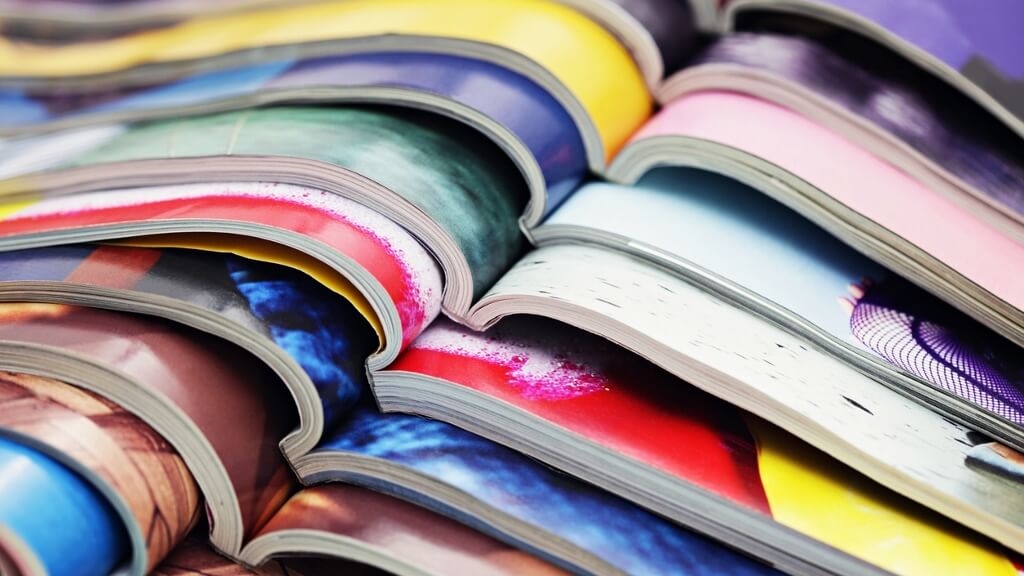
To make sure your print wows your future audience, it’s important to think about the not so small details – like binding. Particularly, the type of binding machine you’re going to use. Take Duplo’ International’s binding machine, for example.
The flexible PFiBIND 2100 PUR Binder allows you to combine design with durability – adding value and excitement to potential customers.